Modern interior design is often very opulent or then merely styled plain and simple in white or grey. In addition to a few purposefully placed colour accents, often just tone-in-tone, traditional or current furnishings complement the bare walls, decorated at most with one or more pictures matching the style. If you are looking for something a little more unusual, you can find ideas in a recent article published by luxurydefined, the online magazine of Christie’s International Real Estate. «Shape up» it says – and continues: «Line up for eye-catching color, bold shapes, and a whole new angle on adding personality to your space.»
With its bold angles and rich tones, geometric design offers a punchy way to add a focal point to any room. So, we’ve rounded up everything from Memphis Group-inspired walls to modern accent pieces to help you embrace this season’s most vibrant colors and graphic shapes, and add a sense of playfulness to your interiors.
Here are 5 ways to incorporate geometric Design in your interiors:
Grand Entrance
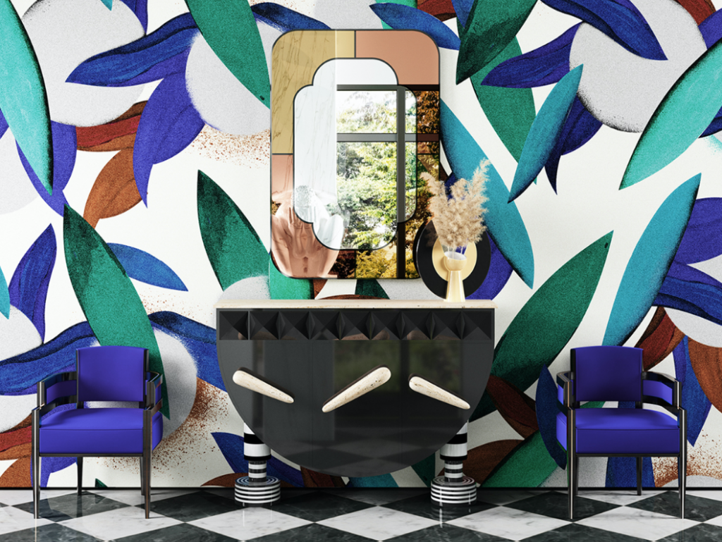
Combine Hommes Studio’s Memphis-inspired Elephant Sideboard with its Art Deco-style Nilo wall mirror to create what its designers call a spirit of “optimistic maximalism.”
Your entry hall is the first room that anyone visiting will see. You only get one chance to make a first impression. Hommés Studio has curated everything you need for an eye-catching hall, in a room-set named Decadent Bohemian Entryway.
In the Ring
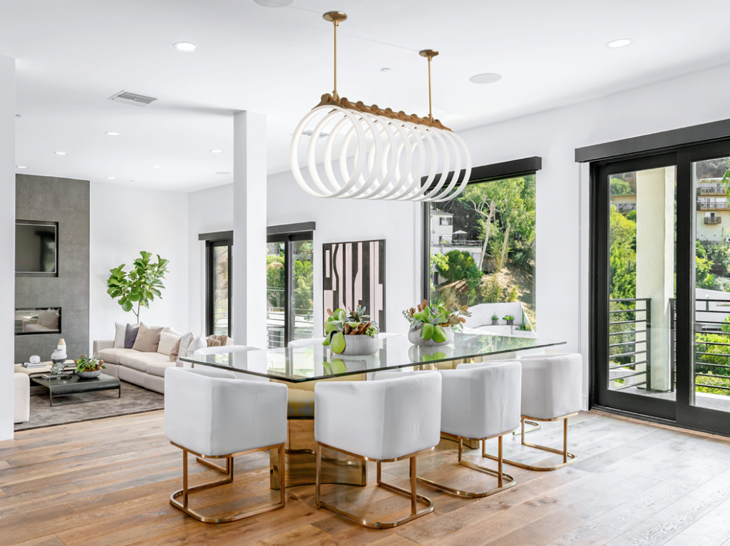
The Samsara 9 chandelier balances the fragility of porcelain rings with the strength of its solid brass spine, a vision that designer Ted Bradley says he sketched “dozens of times” over five years.
It took Ted Bradley a year and “hundreds of fails” to perfect the illuminated rings that make up his Samsara chandelier. Inspired by the “arching ribs of a whale skeleton bleached in the sun,” it is both a piece of sculpture and a lighting solution. Each handmade ring takes weeks to create, and the size, metal type, and finish can be customized. Thanks to its warm, dimmable LED lights, the chandelier will cast a candlelight-like glow over a dining table or illuminate a whole room.
Back to the ’80s
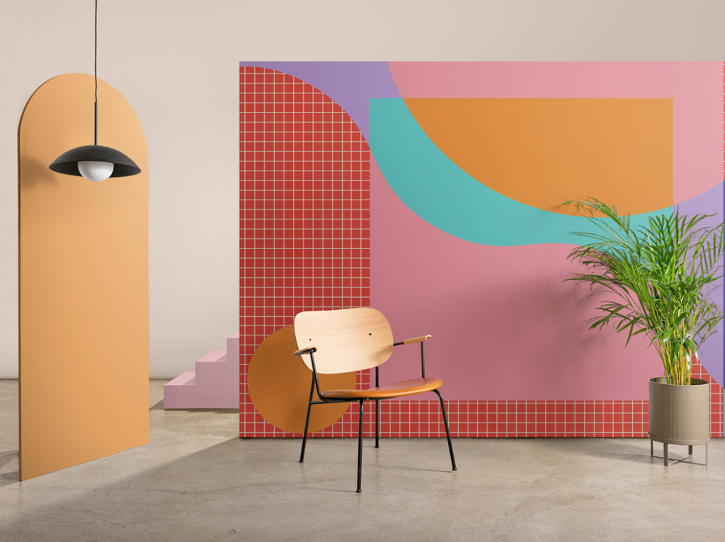
Ettore, one of six colorful murals in Hovia’s Memphis collection, features a bold palette of bright trendy tones, with the aim of creating eye-catching accent walls and a welcoming, playful ambience.
“The Memphis collection has been almost a year in the making,” says Hovia’s designer, Tori Dennett. “After initially drawing more than 70 sketches, we narrowed it down to six designs that we felt took the modern ’80s aesthetic that is so classically Memphis into 2021.”
Seeing Double
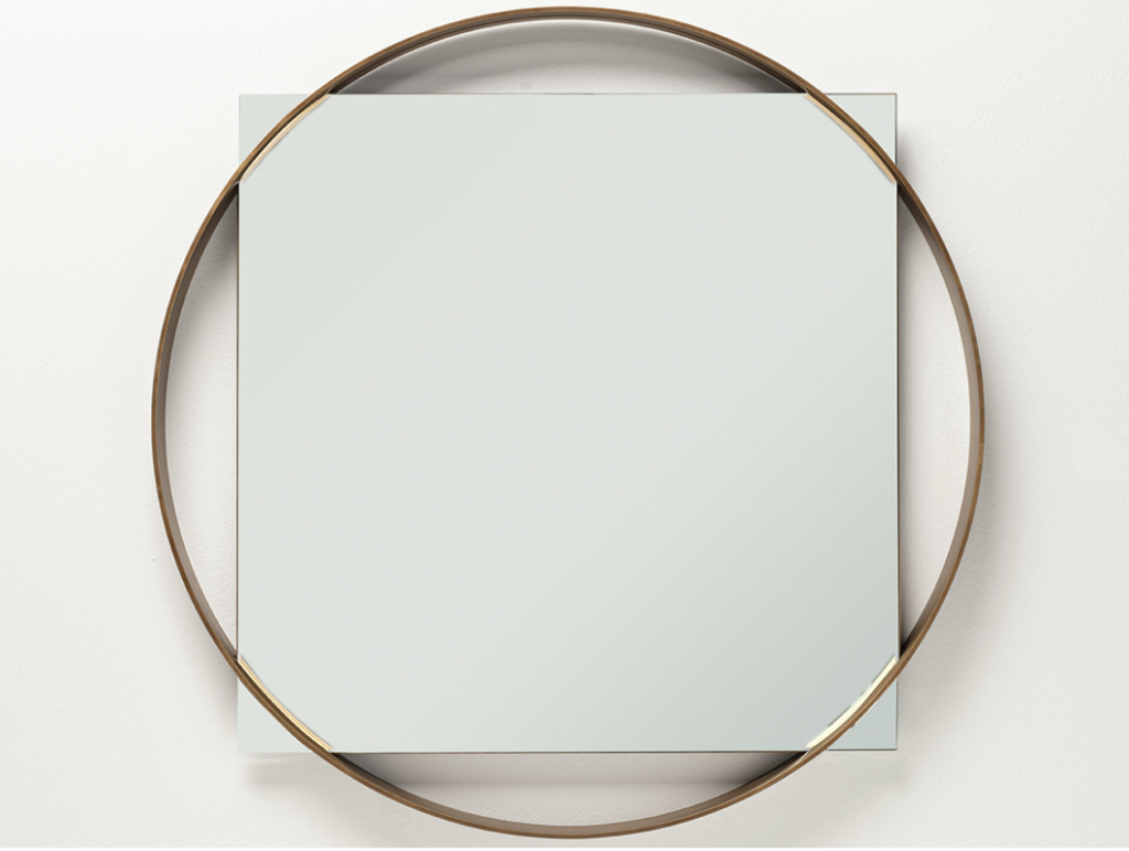
The Twin Mirror uses simple circular and rectangular geometric shapes to embellish and update a traditional homeware look with a sophisticated touch.
As their name suggests, there are two mirrors in the Twin family, each of which has a design contained within a geometric floating frame. Twin One is a square wall mirror that has a delicate brass frame surrounding it, only making contact at the corners. The mirror was designed by Michele die Fonzo for Italian brand Frag.
Hard Times
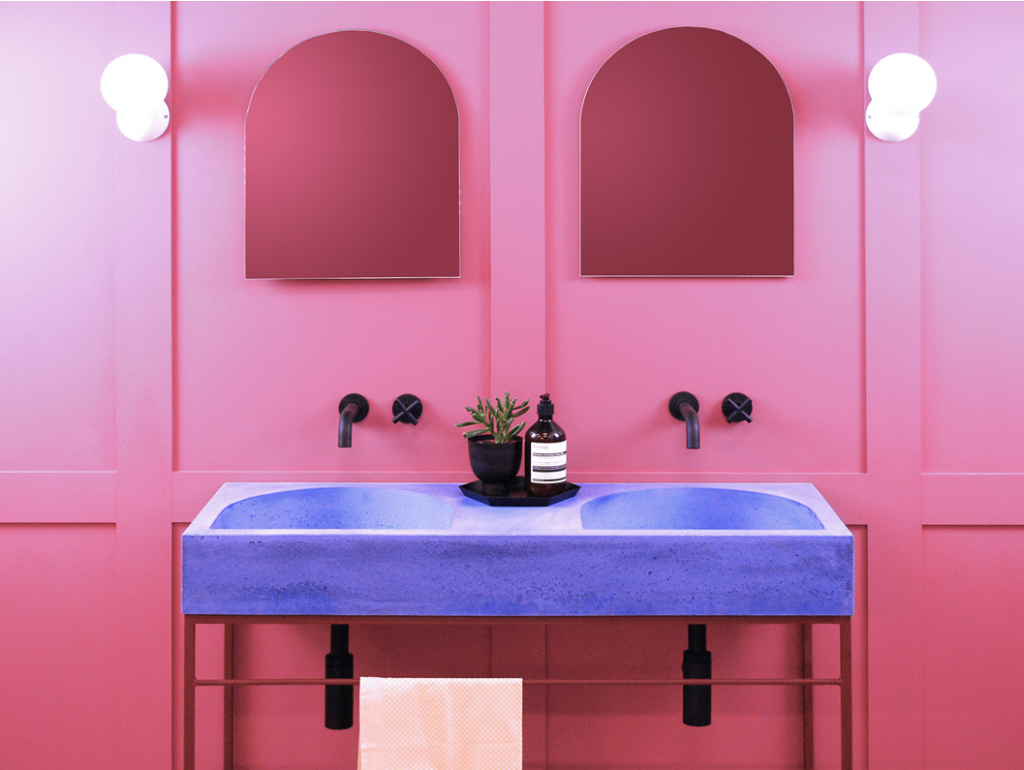
Formed’s collection of basins has been designed to show concrete’s unique patina and texture to its fullest, and its carefully selected range of recycled sands and pigments allows each design to be customized.
The team at Formed Concrete Basins has an enduring love affair with concrete. The latest collection, Arc, showcases that versatility with an unusual range of sinks inspired by the curves of classical architecture, with styles such as Nobu, Koro, and Arch available in a range of 40 colors. Like all Formed basins they are produced using 80 percent recycled materials and can be customized.
