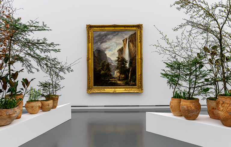
Since 1993 Hochparterre, together with the Museum für Gestaltung Zürich, has been annually awarding the best buildings and objects in architecture, design and landscape architecture. The award-winning projects can be seen at the Museum für Gestaltung, Ausstellungsstrasse 60, Zurich, until 10 January 2021.
And here you can see this year’s prizewinners:
Architecture
Architecture Gold: Residential development Moos, Cham ZG
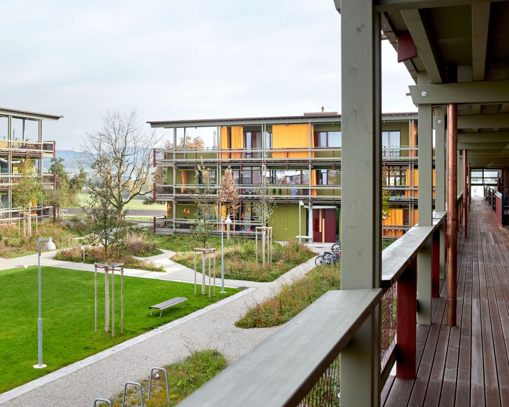
The settlement in Cham stands for a new freshness. Instead of omitting, the architects enrich their design, differentiate layers, strengthen the character of each building component. The main protagonist in this firework of forms is the climate-friendly material wood, accentuated with cheerful splashes of colour. In addition, the settlement does many everyday things right. It sets up a public frame at the edge of the village. The common rooms and the arcades support the neighbourhood.
The flats, whose built-in shelves the tenants can build themselves, are designed for the randomness of life. This is also part of this open and uninhibited architecture.
Architecture Silver: Restaurant and Fishing facility, Genf
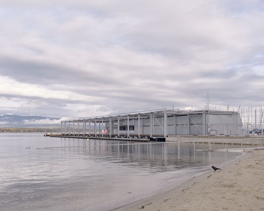
The pavilions on the beach of Geneva combine business and leisure in a relaxed manner. The first house provides space for the fishermen to work after their catch, while the second, with a platform, creates a lot of space to drink a coffee or soak up the sun. The steel architecture with its details brings both worlds together pragmatically and yet poetically. A protective wall keeps the wind out and is folded up to form a canopy. The movable architecture appears technical and airy and light at the same time.
It gives way to the lake. And the buildings open up the shore to the public, while elsewhere it remains private. Other communities should take this as a model for themselves.
Architecture Bronze: Conversion single family house, Allschwil BL
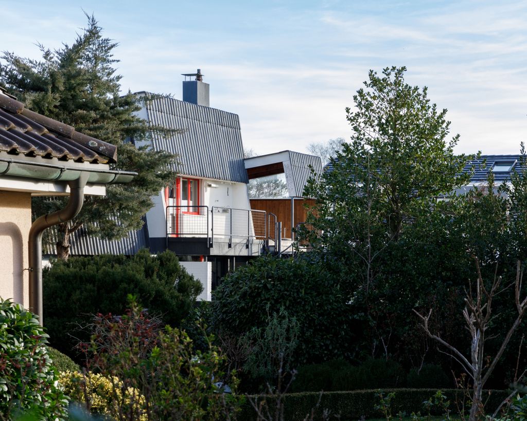
The conversion of the residential building in Allschwil reveals the architectural potential when old and new strengthen each other. The architects clarify the spatial structure from the 1960s. With a few, but targeted interventions, they are upgrading the existing building. With the annex, they set an accent that blends coherently into the existing architecture. The result is a new whole that makes its history and fractures legible. The architects’ conversion strategy is exemplary – even for larger buildings. It teaches us not to demolish existing buildings, but to convert and continue to use them intelligently. This is a task that is pending throughout Switzerland.
Design
Design Gold: Exterior design ‹Circulateur›
Using simple scenographic means, the real space shrinks to an intimate setting: a table, a chair, a lamp, headphones and the book. Specially designed and printed for the production, the book creates a virtual space. Guided by a voice, one scrolls through this space. Thanks to the dramaturgy, the book and the listening room merge into one. Added to this are the haptic experience with the book and the personal sensory memories that are called up. All parts are carefully designed: Trickster-p combines the media installation, performance, book and listening room into a new, independent format in which the audience becomes a single actor.
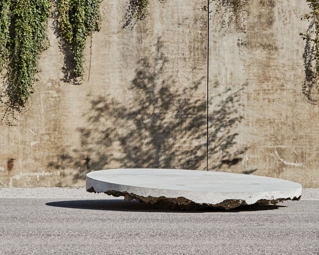
Inch Furniture is sending a strong signal for the new Museum Quarter in Lausanne. The designers combine the circular seating elements on ‘Plateforme 10’ with simple street furniture. This is how they react to the prominent architecture. The project is convincing on all levels: in the user-centred perspective, which takes into account the needs of walkers, museum visitors and the client. In the formal design, which guarantees diversity of use and surprises with its precise, random form. In the haptic diversity of the surfaces. And finally, in terms of production technology, in that on-site production saves on transport routes.
Design Silver: Installation ‹Book is a Book is a Book›
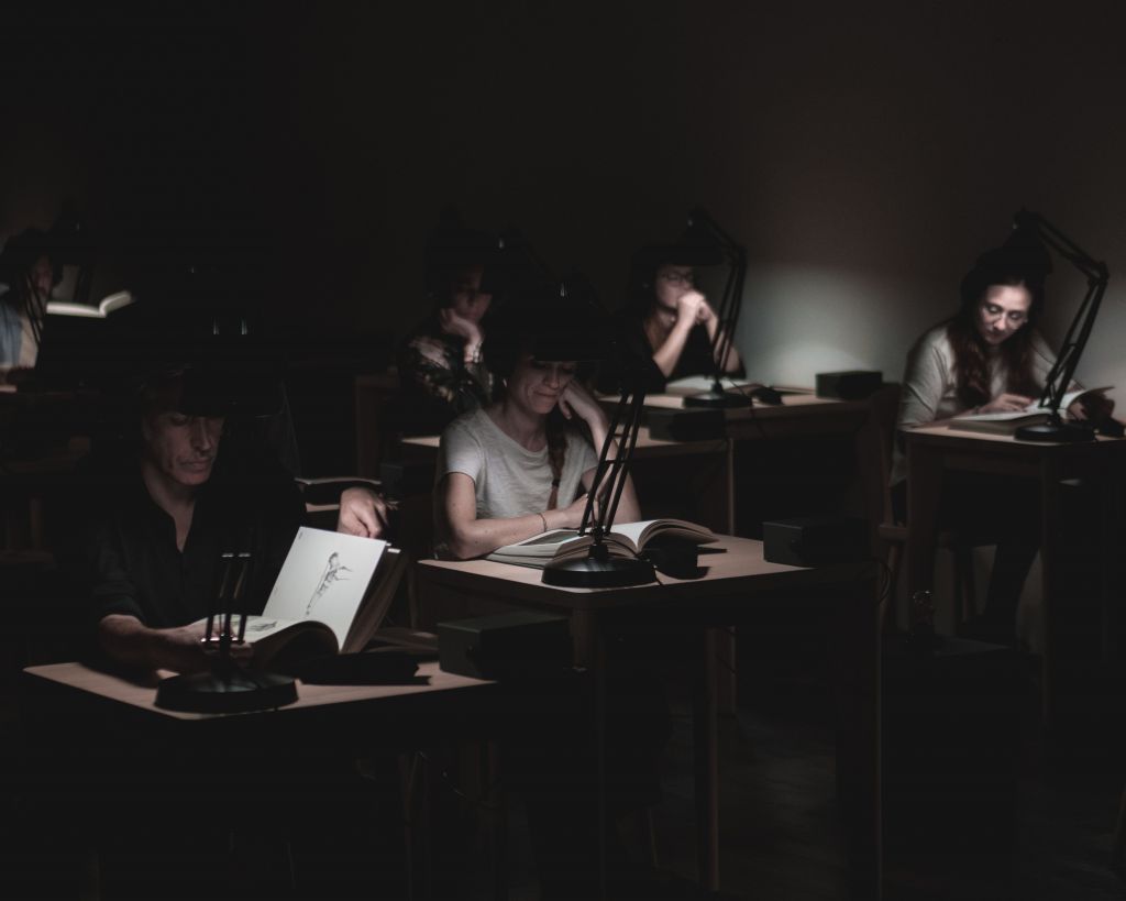
Using simple scenographic means, the real space shrinks to an intimate setting: a table, a chair, a lamp, headphones and the book. Specially designed and printed for the production, the book creates a virtual space. Guided by a voice, one scrolls through this space. Thanks to the dramaturgy, the book and the listening room merge into one. Added to this are the haptic experience with the book and the personal sensory memories that are called up. All parts are carefully designed: Trickster-p combines the media installation, performance, book and listening room into a new, independent format in which the audience becomes a single actor.
Design Bronze: Interaktives Display ‹Interactive Replicas›
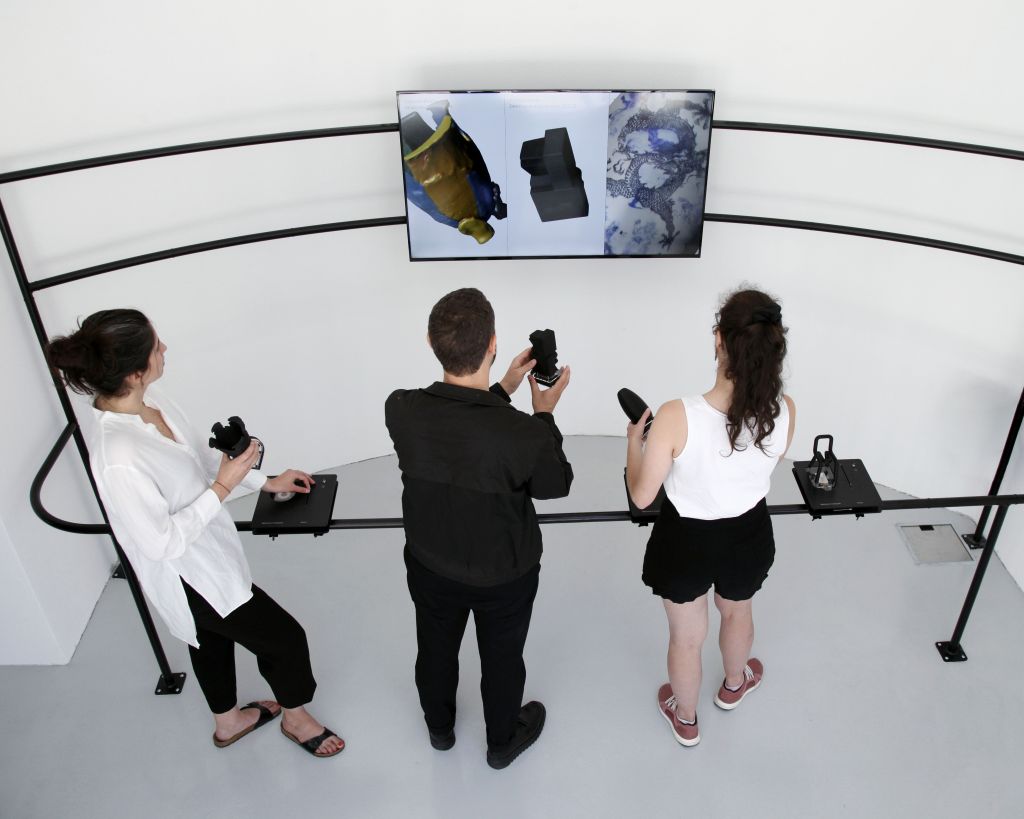
Das Projekt kümmert sich um die Vermittlung von Design. Mit einem Replikat, das die Museumsbesucherin in die Hand nehmen kann, und einem digitalen Doppel auf einem Bildschirm. So entsteht Nähe zu Artefakten, die die Besucher erkunden können, was in Museen sonst nicht möglich ist. Der Aufbau ist schlicht und intuitiv. Die Designer verzichten auf eine VR-Brille, die Besucherinnen bleiben im Raum präsent. INT Studio wird seine Arbeit als methodische Grundlage auch für andere Aufgaben nutzen können. Das Projekt steht als cleveres Bindeglied zwischen digitaler und analoger Welt: Damit wir mit Augen und Händen erfassen können, was sonst hinter Vitrinen verschlossen bleibt.
Landscape Architecture
Landscape Architecture Gold: Media garden SRF, Zürich
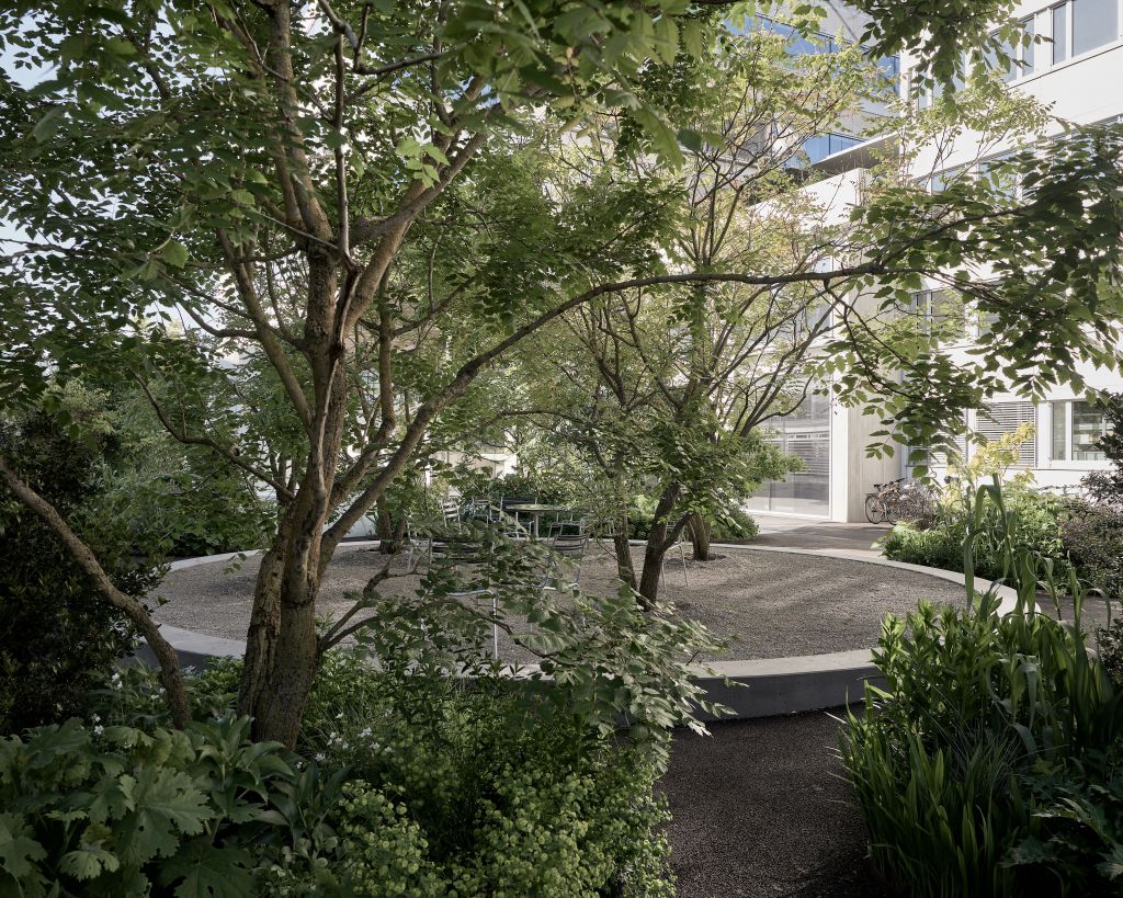
The project shows which green spaces are possible on a parking deck. Krebs und Herde succeeds in creating a type of open space whose attraction is that it is difficult to classify: Is the ‘media garden’ a long park, a lush garden or a planted passage? It is a bit of everything, and that is all well and good. Its formal qualities are just as convincing as the plant cocktail, which testifies to the office’s expertise and connoisseurship in this field. The catchy garden picture drawn by the landscape architects plumbs the poles of nature and artificiality, but is also a spatial experience. This garden without a clear direction defines an ambiguous, new type of landscape architecture with space-creating plant backdrops and experimental plant communities.
Landscape Architecture Silver: Public beach and harbour Eaux-Vives, Genf
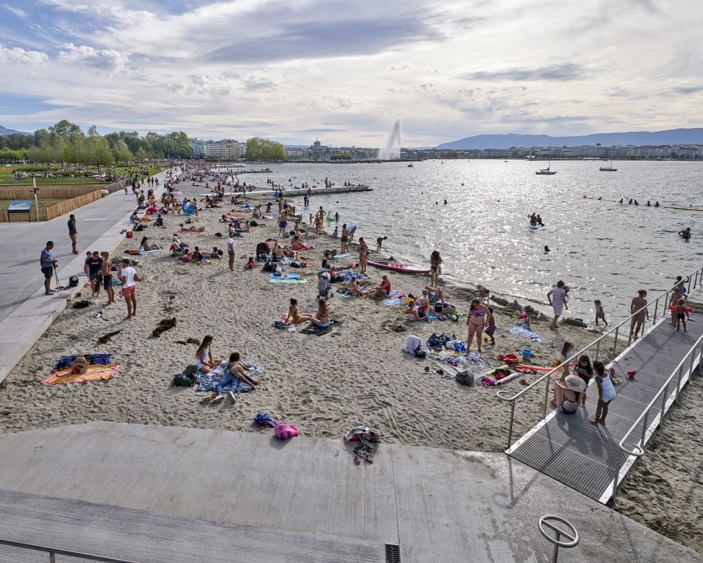
The new urban beach is a bold and impressive project. The design, engineering, hydrological and ecological requirements could only be mastered by an interdisciplinary team of engineers and other specialists, in which landscape architects had a firm place. The project had to overcome many political and technical hurdles, but was nevertheless able to remain true to itself. The beach was created on the initiative of the project authors. The result improves the living environment for all the people of Geneva. For once, the city is not created by buildings, but by land – landscape architecture makes urban development.
Landscape Architecture Bronze: ‹Parc des anciennes serres› and Outdoor spaces ‹Coopérative d’en face›, Neuenburg
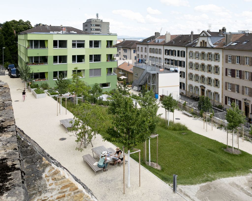
The history of the conversion of the area of the former city nursery into a neighbourhood open space is long, and the project had to overcome many political hurdles. But the stubbornness has paid off:
The result is a garden-like open space with flowing transitions between public and private. The neighbourhood park is also impressive with its transitions between tree grove and cooperative garden, between playground and staircase or between retaining wall and terrace. The design is always developed out of the location. The uses for different age groups are cleverly distributed over the sloping terrain. Many corners are also habitats – the complex is a place of biodiversity.
The Rabbit – Senn Prize for Young Architecture
The Rabbit: Detached house, Vira Gambarogno TI
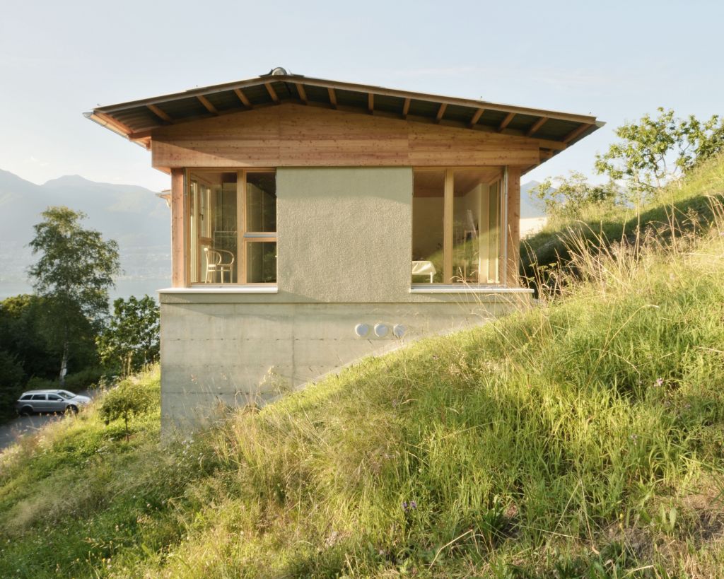
The detached house in the Vira district of Gambarogno is inspired by history, but not historicising it. The skilfully constructed hybrid building by Viola Valsesia is not a purebred, appears in warm tones but is nevertheless restrained in colour. The wooden roof unites the rooms without dominating them. The front to the lake is open, as is the façade uphill to the orchard and forest. The rooms are appropriate, neither small nor large. The furniture is precisely crafted, but anything but detailed. In short: the house is not an exerted radical, but a prudently complex – and therefore a remarkably mature first work.
