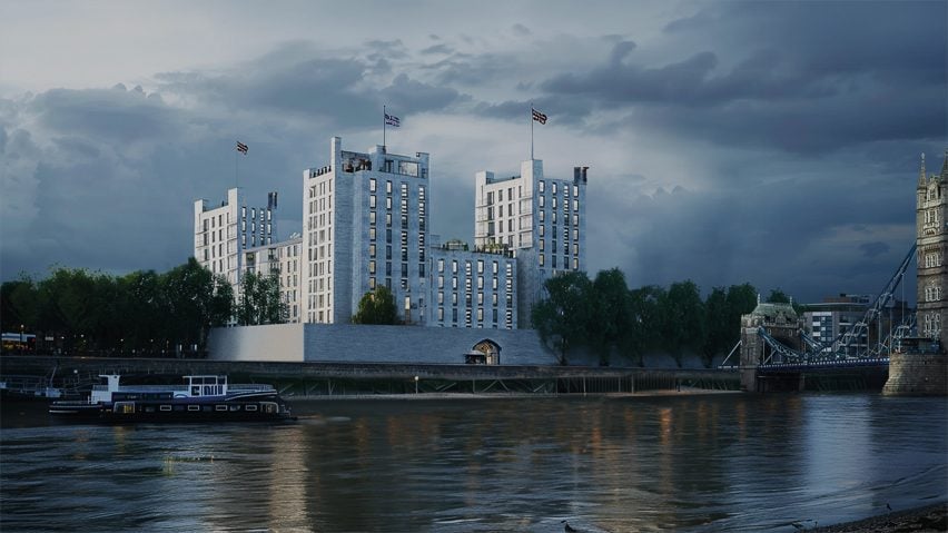
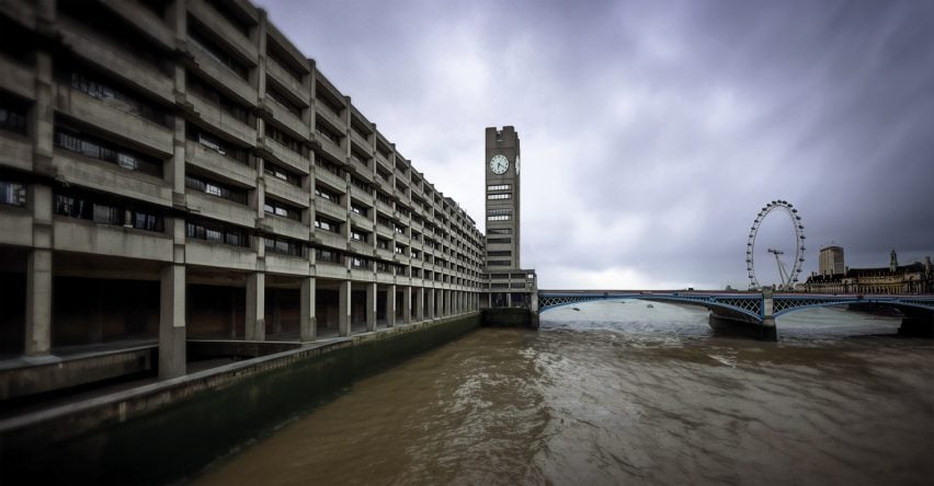
Thomas Heatherwick’s Humanise campaign creates “boring alter-egos” of UK landmarks, was the title of a recent article in the online magazine dezeen about a campaign run by his architecture studio together with the creative agency Uncommen Creative Studio. And continues: “Created to demonstrate how UK landmarks would look if designed in modernist styles, the agency used artificial intelligence to reimagine the landmarks. Along with Buckingham Palace and Edinburgh Castle, Uncommon Creative Studio created alternative versions of the Tower of London, Royal Liver Building, Palace of Westminster or Hovis hill.“ Heatherick’s Huminse campaign is a 10-year global campaign to address the health problems caused by poor buildings and encourage the public to demand better solutions.
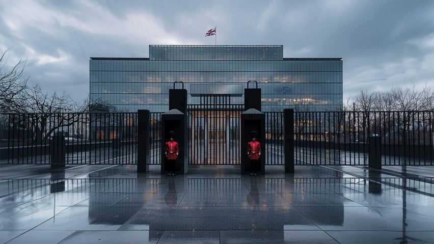
The neo-classical Buckingham Palace, the main facade of which was designed by architect John Nash, was transformed with Artificial Intelligence into an international-style block. Photo: dezeen
“The series of images shows six of the most loved and quintessentially British landmarks stripped of their personality to reveal their boring alter-egos,” said Uncommon Creative Studio, which is a Humanise campaign founding partner.
“Using artificial intelligence, fed with 75 years of soulless development data, UnLandmarks reimagines Britain’s most beloved buildings through the eyes of its most boring architectural trends.”
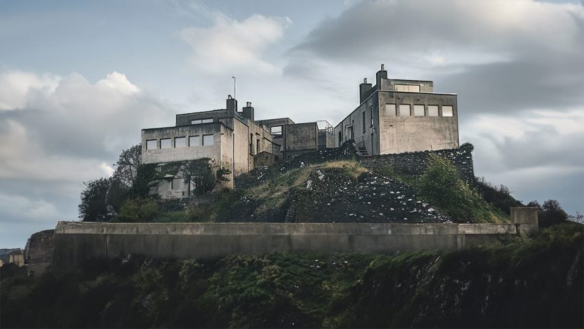
Uncommon Creative Studio created “boring alter-egos” of buildings including Edinburgh Castle. Photo: dezeen
Uncommon Creative Studio created the visuals for the Humanise campaign, which was launched last year by UK designer Heatherwick, as it believes that images are the best way of conveying the campaign’s message.
“We wanted to bring public attention to bear, to create a conversation around the importance of our built environments and the power of design to do more than inspire but to improve our human health,” Uncommon Creative Studio founder Nils Leonard told Dezeen.
By transforming well-known architectural landmarks into buildings that reflect the boredom of many buildings in our neighbourhood, British designer Heatherwick wants to provoke a conversation with the public and raise awareness for a cultivated building culture.
dezeen continues: “The neo-classical Buckingham Palace, the main facade of which was designed by architect John Nash, was transformed into an international-style block, while the Charles Barry-designed, gothic revival Palace of Westminster was given a brutalist makeover.
The Tower of London and Edinburgh Castle were given modernist makeovers, while the Royal Liver Building in Liverpool was reimagined with glass and steel facades.“
The campaign seems to have achieved its goal. Leonard told Dezeen: “Initially people reacted with disgust, which is great, and shock, fascination. A bit of outrage that we’d tampered with iconic, beloved landmarks. Then a worry these were real plans for redevelopment. Most people got what we were trying to do.”
